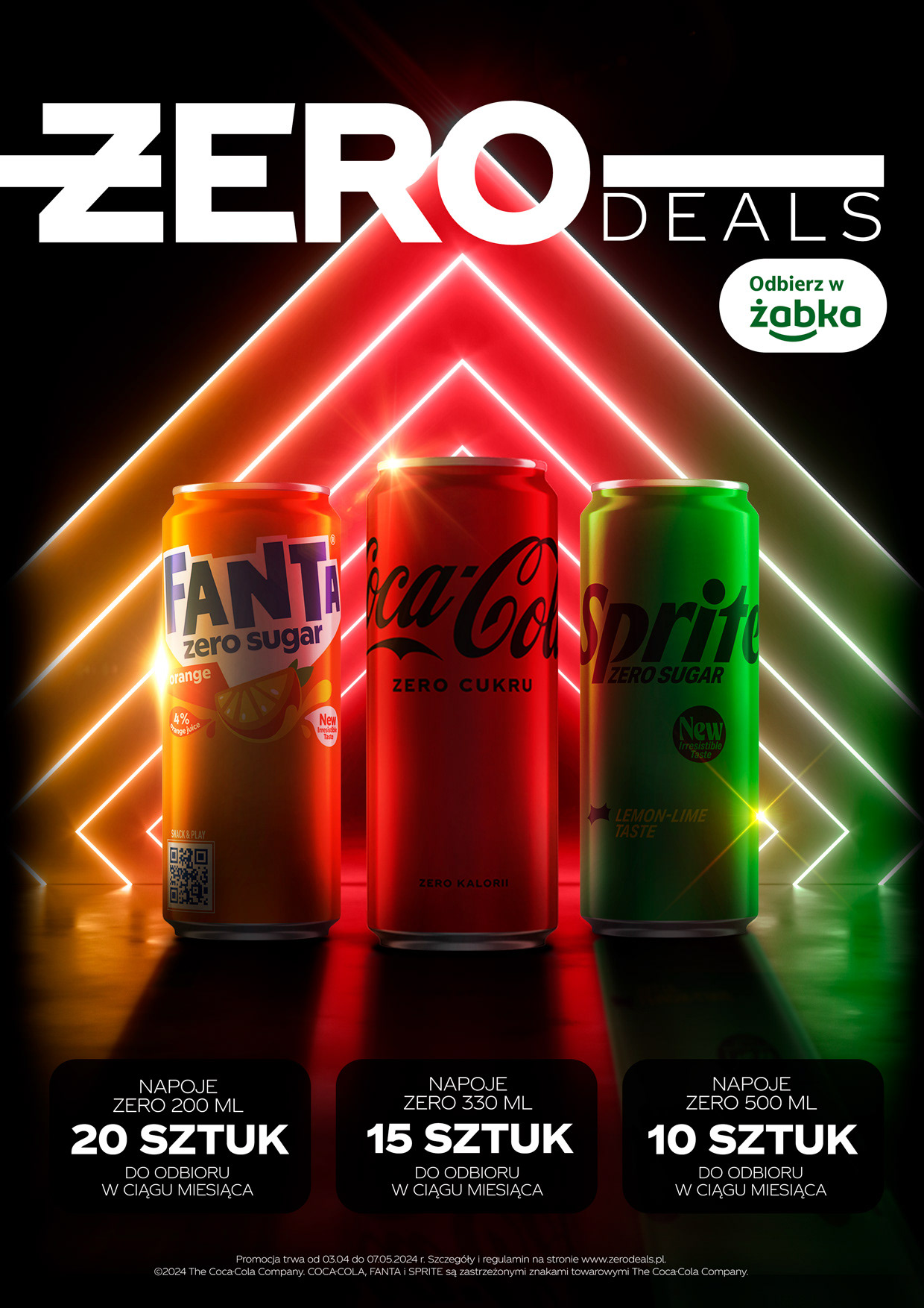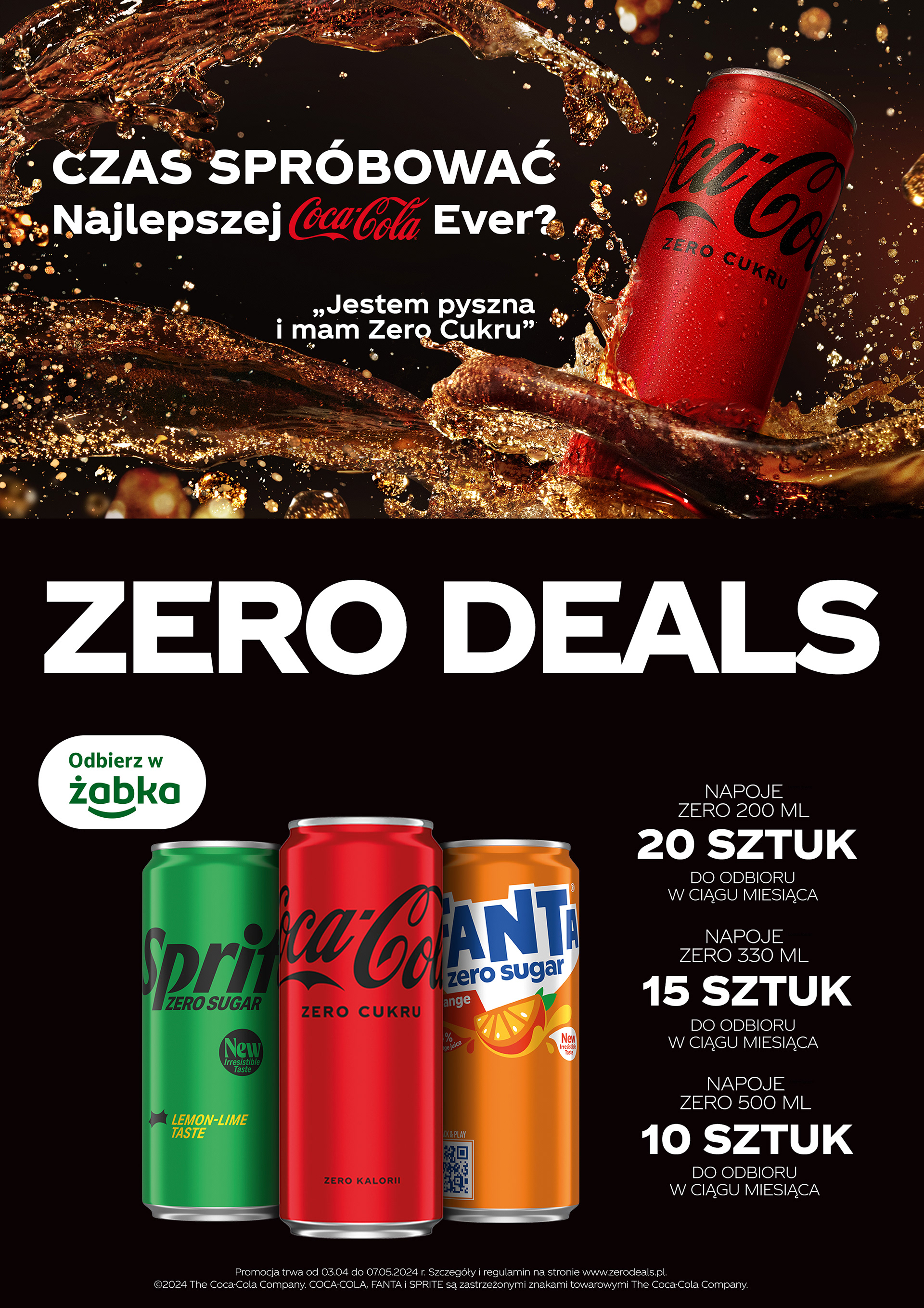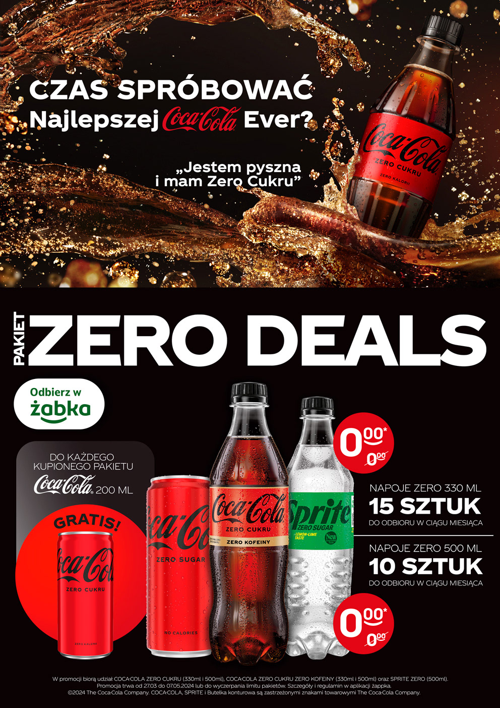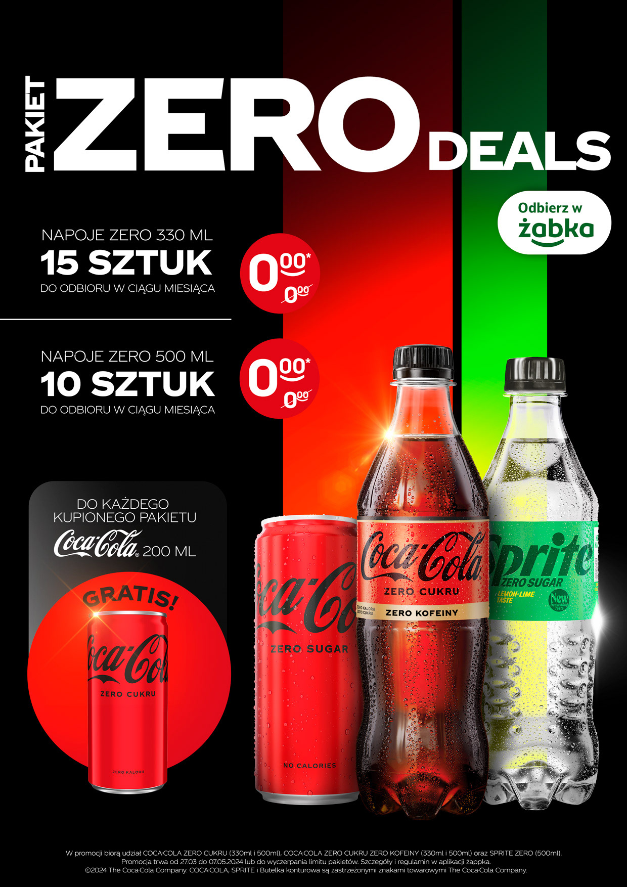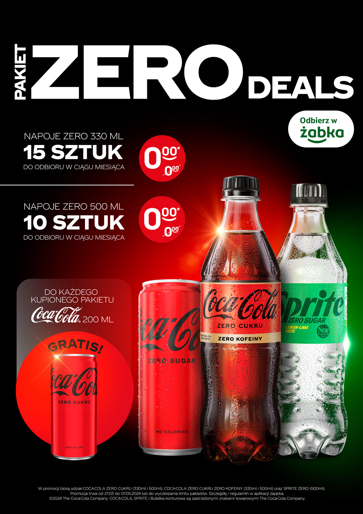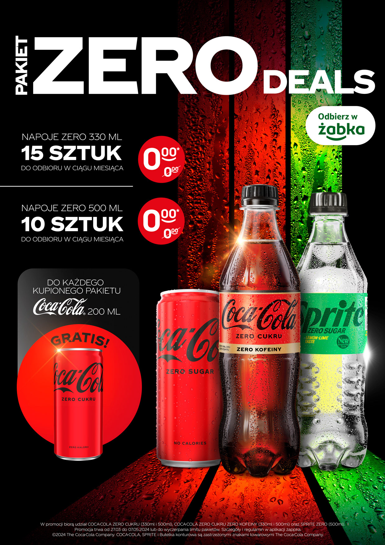
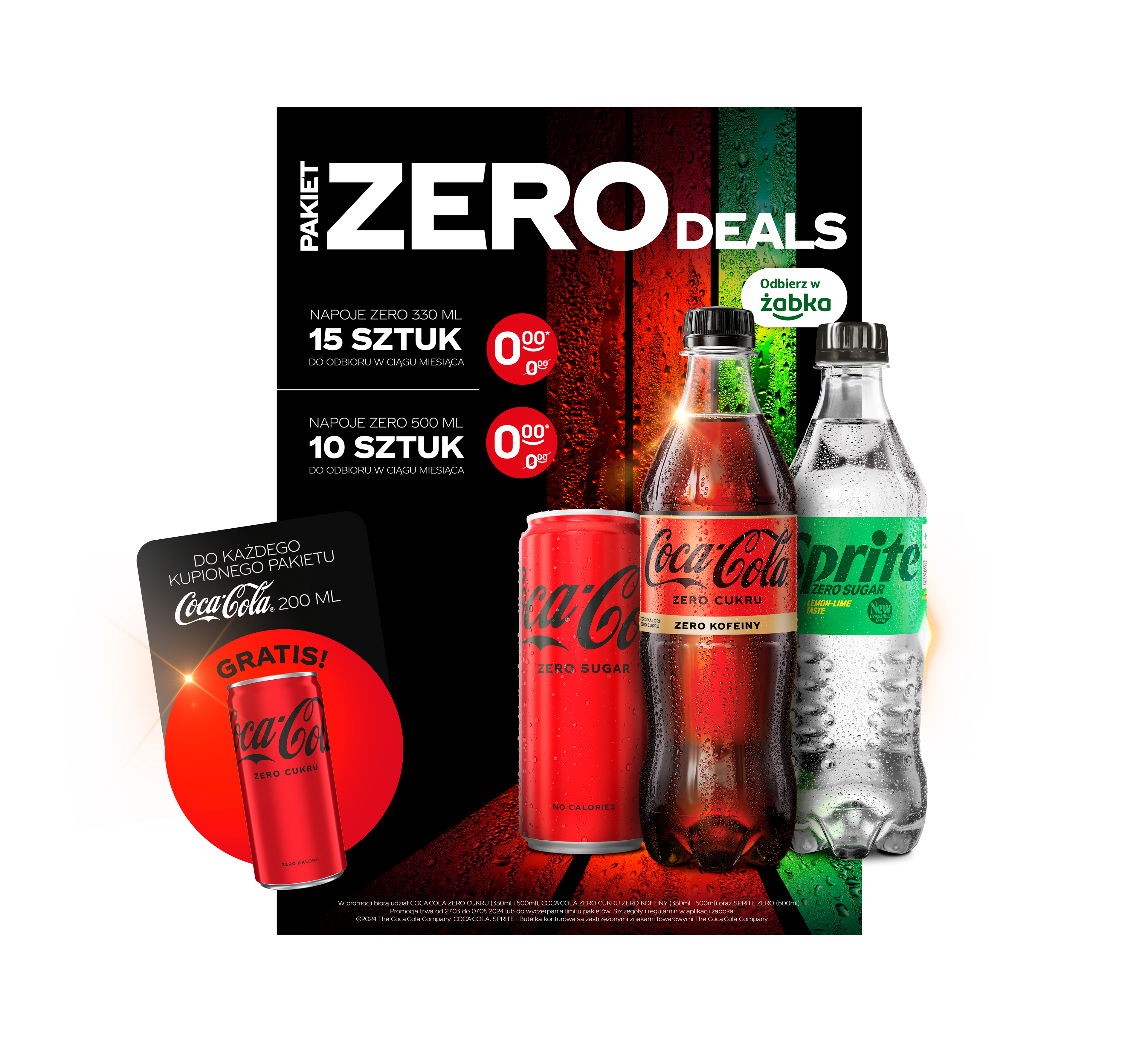
The brief? Turn a simple “zero sugar drink subscription” into a bold, eye-catching promotion.
What I got to start with: just the cans and a font – no lighting, no ready visuals, no key visual to adapt. Everything else had to be built from scratch.
What I got to start with: just the cans and a font – no lighting, no ready visuals, no key visual to adapt. Everything else had to be built from scratch.
I developed the creative concept based on the look and feel of Coca-Cola Zero, keeping it clean, strong, and graphic. Multiple layout options explored different visual treatments, all aligned with the brand’s tone and the promo’s core mechanic. The result? A set of visuals that clearly communicate the idea and stand out across channels – from digital to in-store.